.
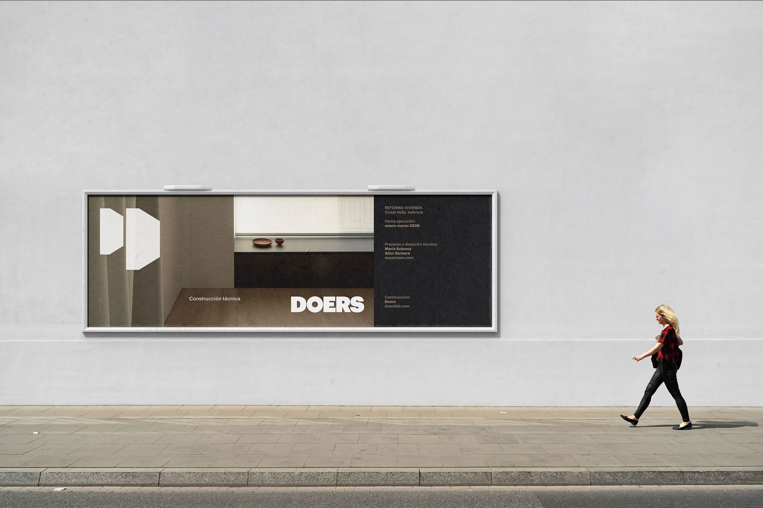
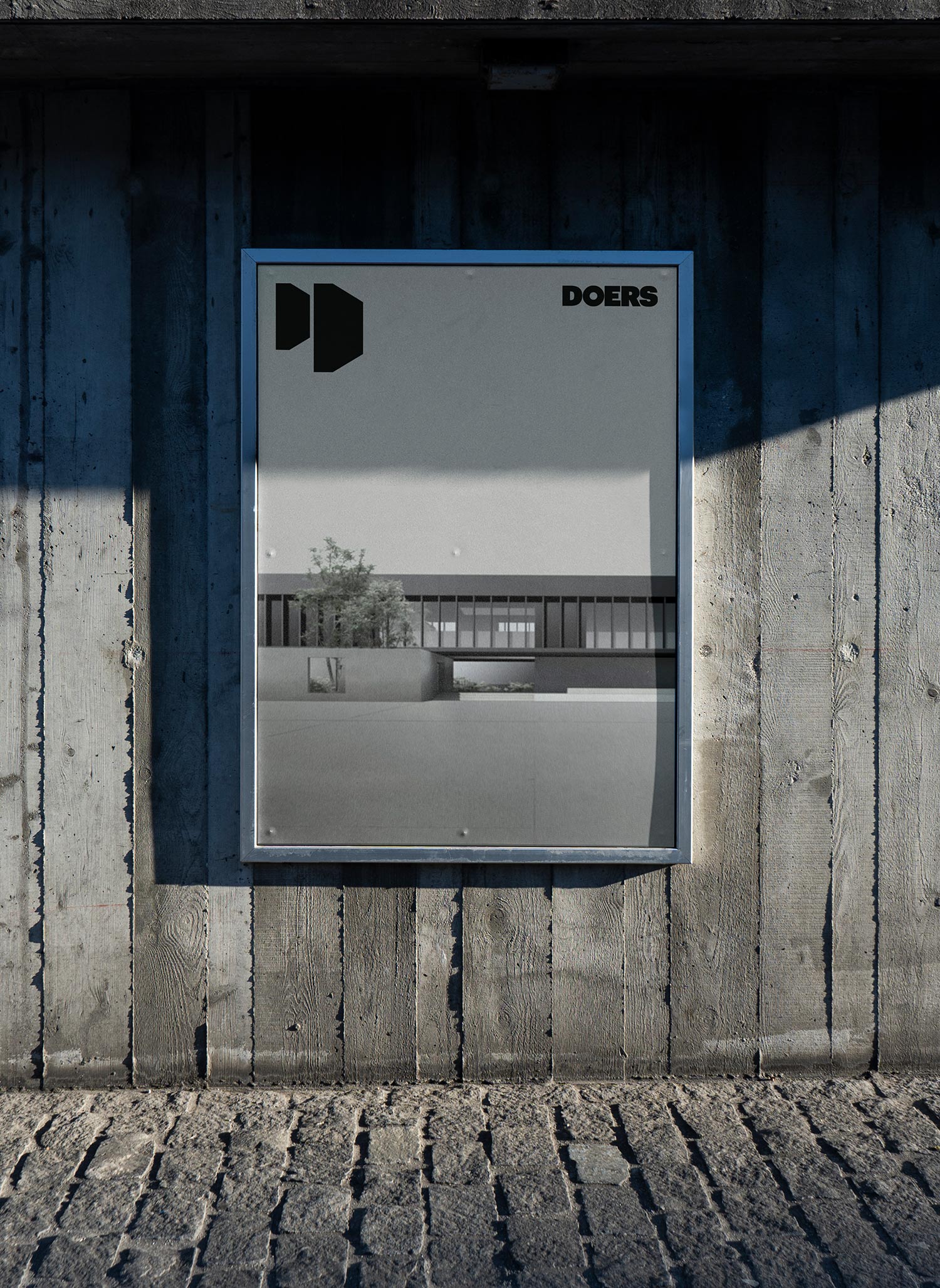
DOERS is a construction company conceived by and for architects. Its identity had to reflect both the technical dimension and the project-based vision that define its way of working.
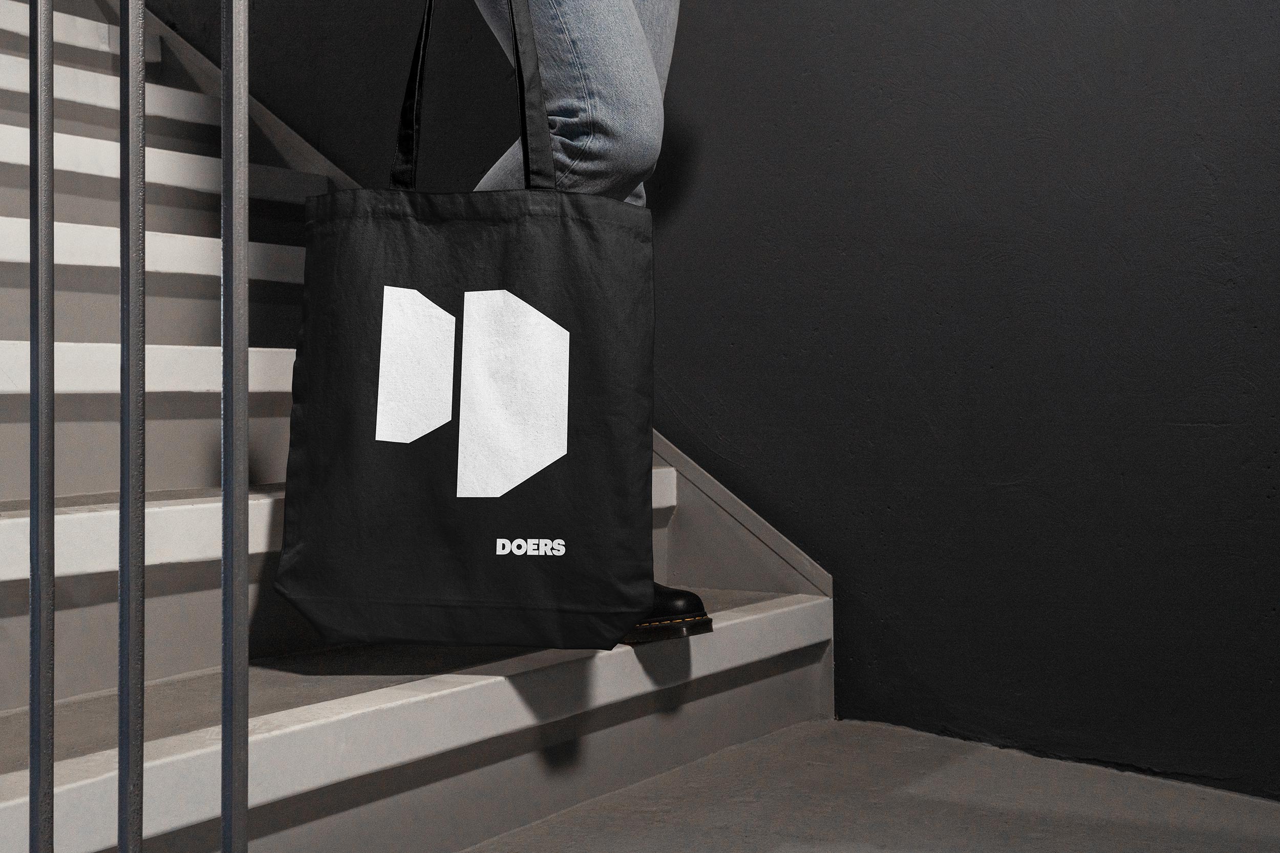
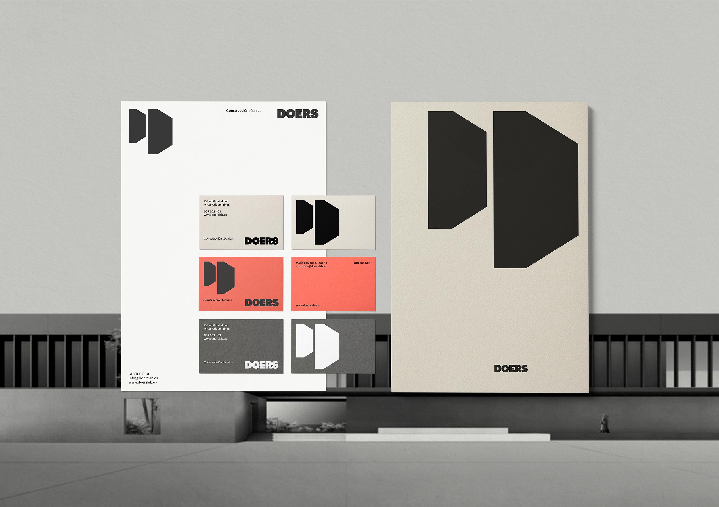
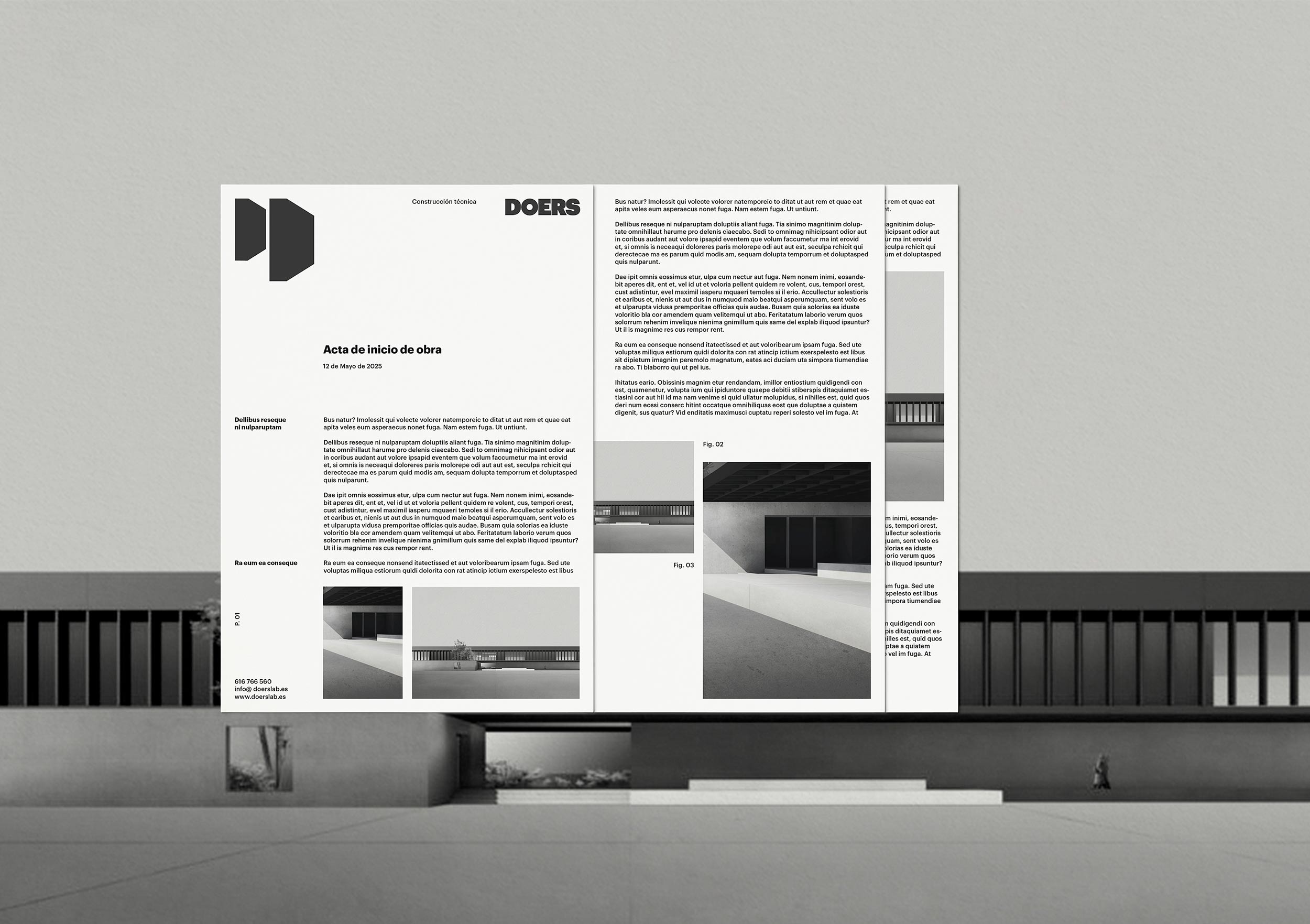
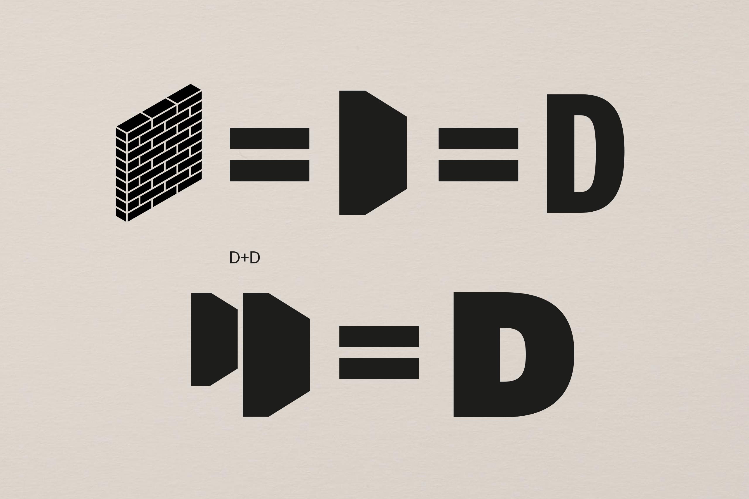
The symbol is built from a synthetic representation of two walls in perspective. Each wall takes on a shape reminiscent of the letter D, and together they form a solid volume that occupies exactly the same space as the initial letter in the logotype. A compact, meaningful, and distinctive structure.
The chosen typeface, geometric and bold, conveys solidity, precision, and control. At the same time, the overall result is one of elegant force: free of ornament, direct and confident—like well-executed architecture.
A visual identity designed to project trust, clarity, and execution capacity. As the name suggests: DOERS.