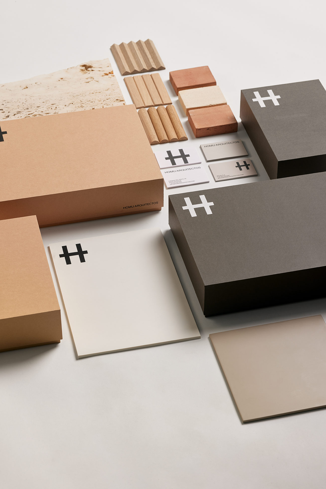
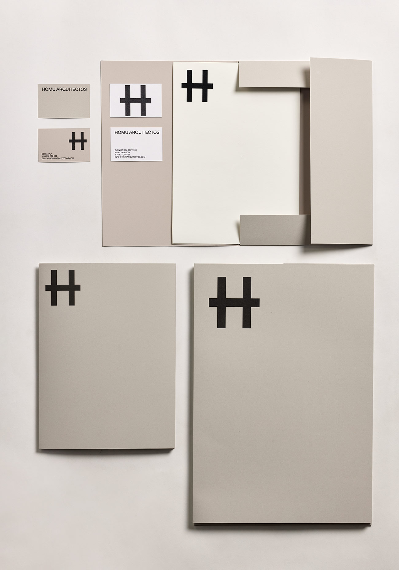
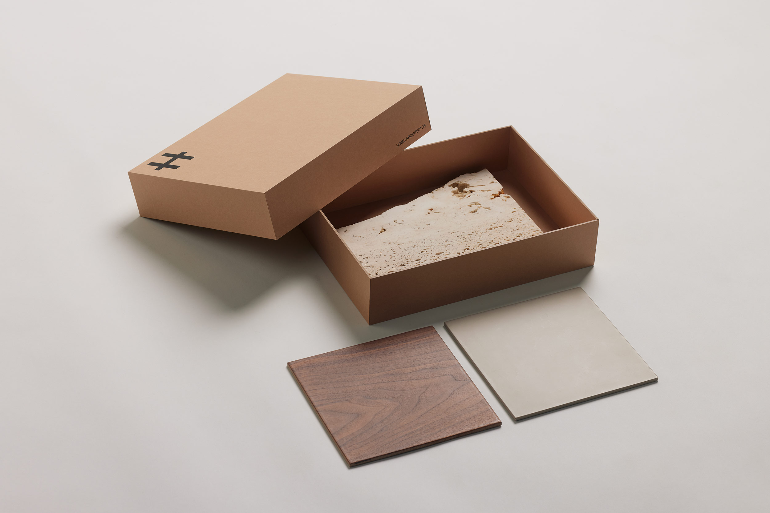
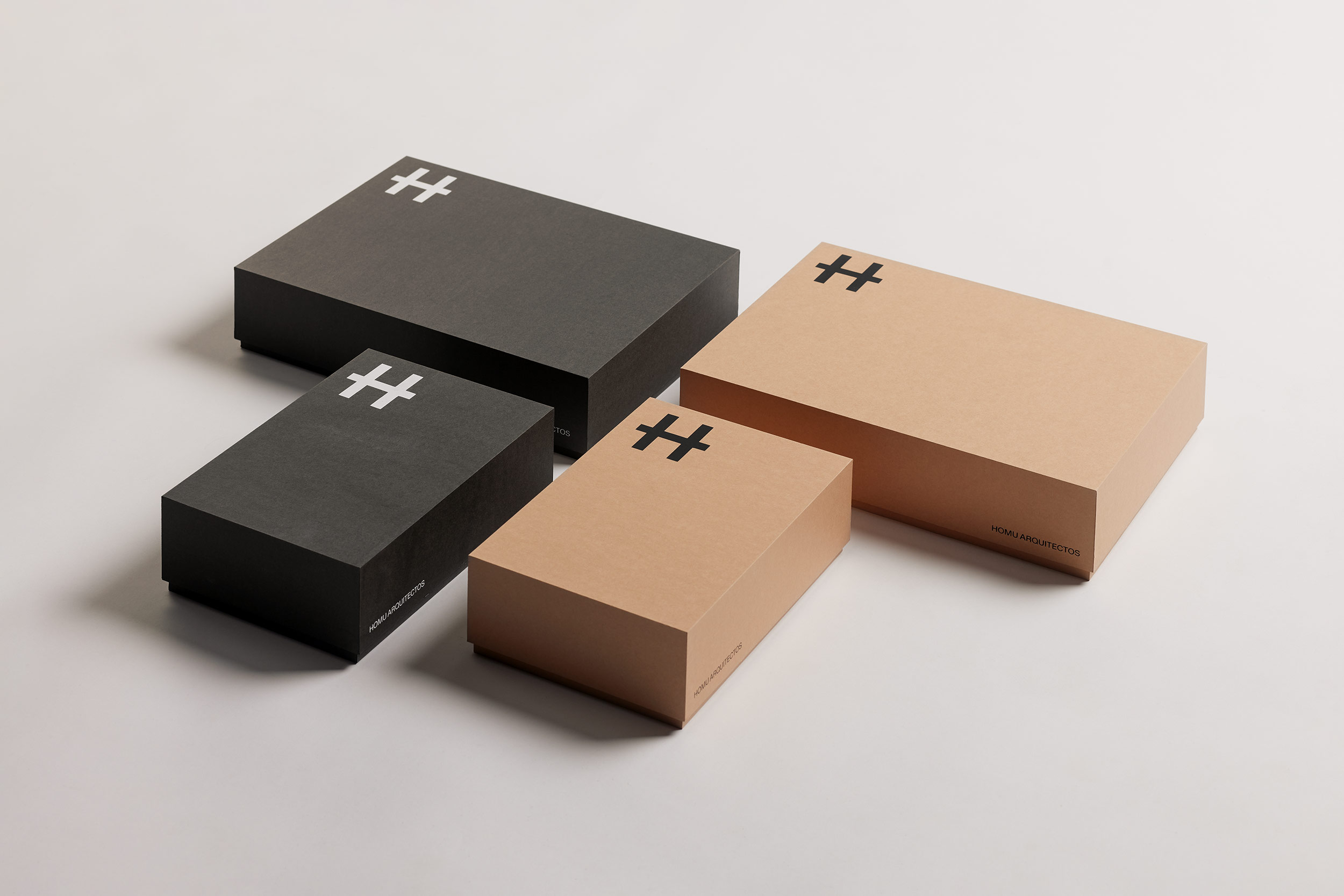
Homu: cards, boxes and folders..
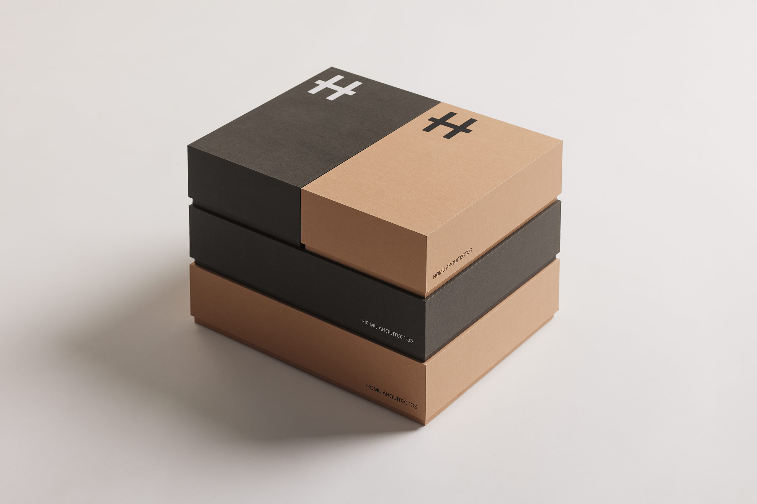
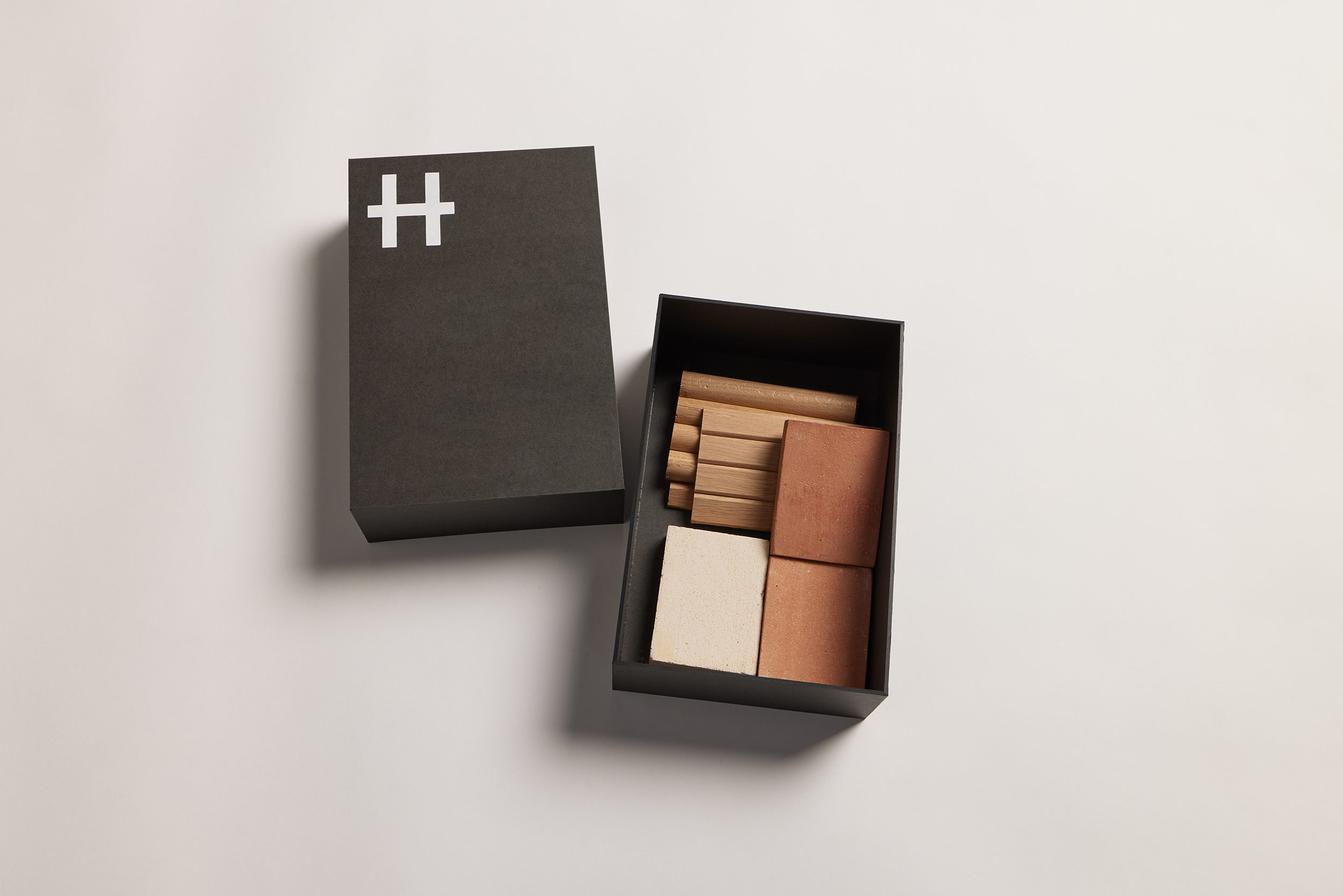
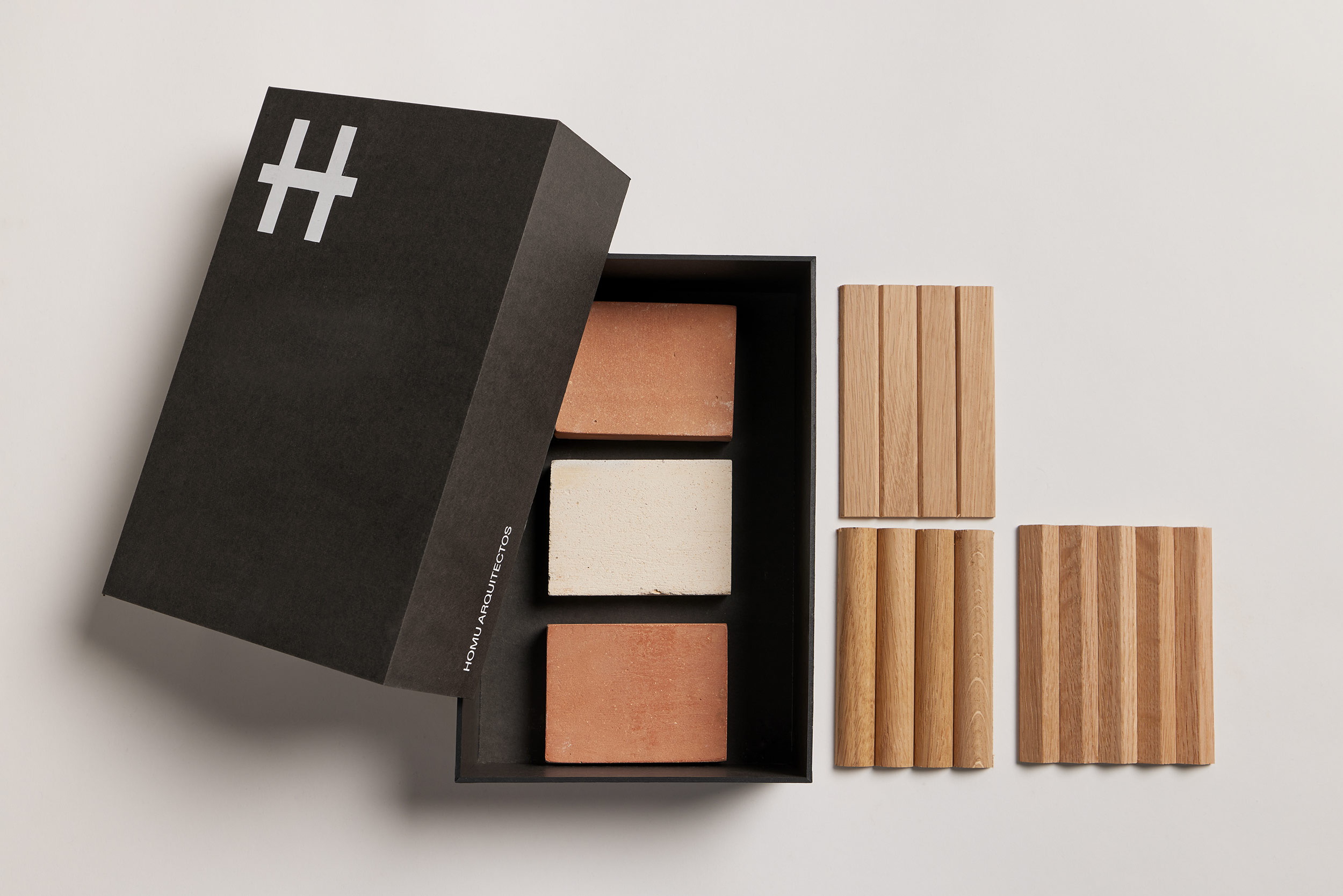
In addition to the usual business cards, stationery and envelopes; The corporate identity of Homu Arquitectos incorporates a set of boxes and folders in sizes Din A3, Din A4 and Din A5. Homu Arquitectos takes great care of the presentations it offers to its clients, both of the projects and reports and the presentations of reference materials. The range of colors goes through black or white in which the logo is applied in addition to backgrounds in earth colors, gray, white and black.
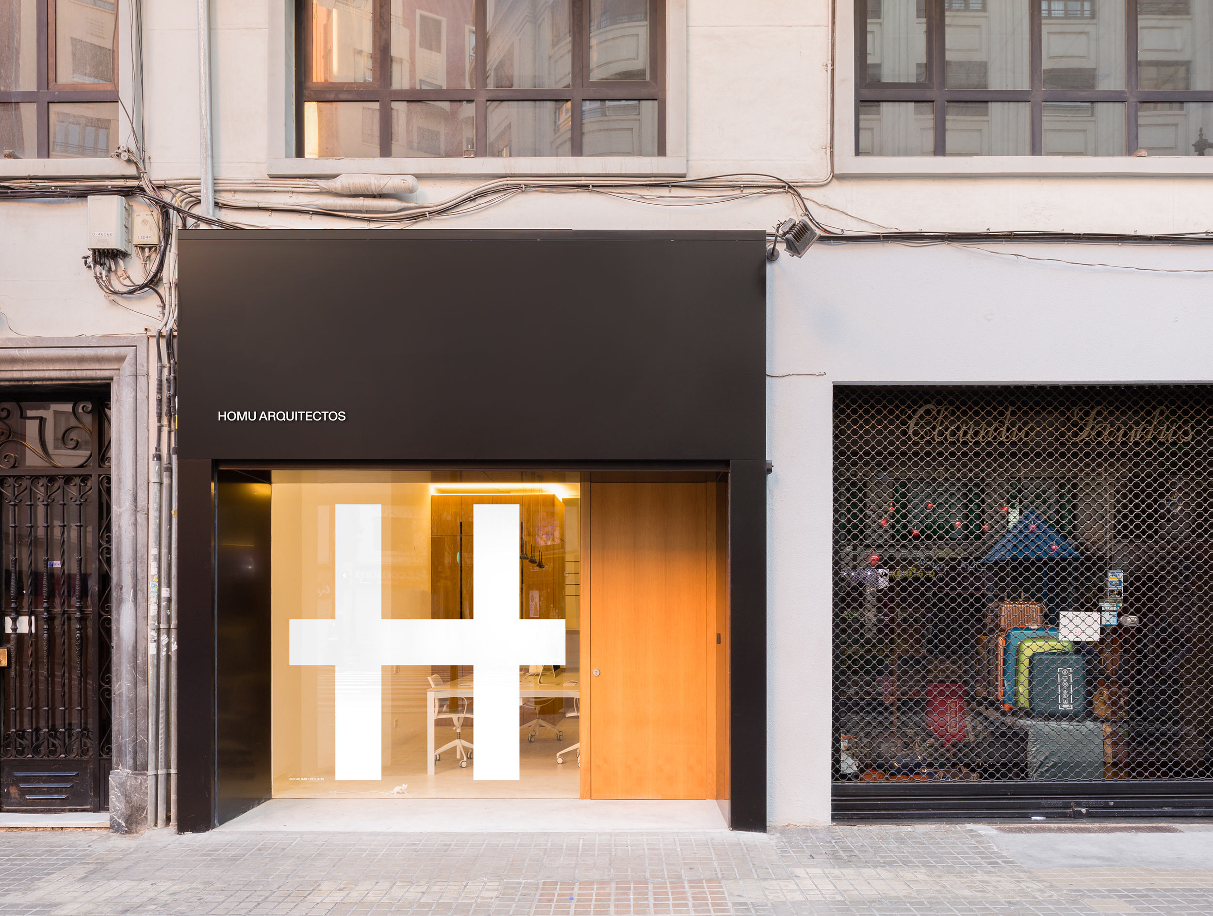
Homu means house in Japanese. The sign is an exercise in abstraction built from 3 identical strokes, as an ideogram of oriental writing, from the formal coincidence between the letter H and a construction of traditional Japanese architecture. The symbol shows simplicity, normality and neutrality. It is applied in a proportionally large size compared to the rest of the elements of each support, generating a forceful presence of the identifying element.